A new look
How the new Respellion website came about.
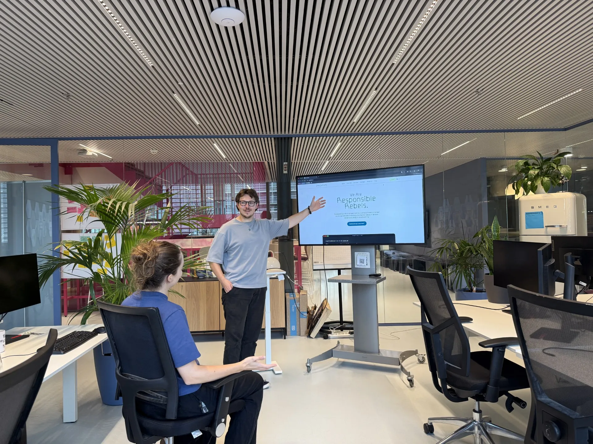
Respellion recently launched a new website with a completely new look. We designed, built and took ownership of it entirely ourselves. We’d like to walk you through the whole process: from the first sketches to the technical choices.
Digital sovereignty as the starting point
At Respellion we think it matters to manage our own digital environment ourselves. That means we decide how our systems work, we can step in whenever that’s needed, and we don’t depend on an external party. For our own renewed website we were able to carry that principle through in full for the first time. No design agency making the design or taking over the development, but our own team managing everything from start to finish.
With our previous website that was a problem: we wanted to make a change, but we couldn’t do it ourselves. So we decided to build a new website ourselves. After all, we have all the knowledge and expertise in house.
Two directions, one deliberate choice
The process started with Tessa and Niek, who independently set to work on two design directions: fully built in house on the basis of our existing house style, with the previous website as a starting point. During this process we also used Claude Design, and a number of nice elements from it made their way into the final design in our own way.
The whole team was involved in this process by presenting designs, discussing preferences together and working all the feedback into the details. In doing so we didn’t just look at the visual aspects, where recognisability and usability matter. We also took a critical look at our story as an organisation and at how well the design fits the way we want to present ourselves.
“We took a critical look at our story as an organisation and at how well the design fits the way we want to present ourselves.”
The technical implementation
For building the website we deliberately chose open source technology: Astro and Tailwind. These are technologies with a large community that fit our use case exactly.
Astro is modern and made for content-driven websites: it generates static pages wherever it can, which makes the website load fast while still leaving room for interactive components. For the styling we used TailwindCSS 4, which gives us a consistent design without having to keep track of separate CSS classes all the time.
An important architectural principle in the build was modularity. The website is made up of a set of reusable components: separate building blocks for things like text sections, images, call-to-actions and overviews. These components are driven from .mdx files, where content and structure come together. Every page is put together from these blocks and components, each with its own content and variations. Individual Tailwind classes can be added to these blocks to introduce some variation in styling.
“We deliberately chose open source technology, such as Astro and Tailwind. These are technologies with a large community that fit our use case exactly.”
What this gives us
The result is a website that our whole team contributed to, of which we manage every part ourselves and through which we can tell our story as an organisation properly. The architecture is deliberately set up so that we can make future changes ourselves, such as new pages, adjusted content and new components, without a design agency.
And just as important: full ownership of design, code and infrastructure sits with our own team.